Hello beautiful stitchers! Welcome to Part 2 of choosing colours with confidence. Remember in my last post, I showed you how I use variegated threads as a starting point for choosing a colour palette? I was working with some new students last week and they loved this idea. But what if you have a very specific colour or colours you want to start with? How do you go about it then? Well it is exactly the same, only you turn the process around a little. Let me show you an example.
I started work on a new project last October. I had a very specific design inspiration in mind and my starting point was yellow and green. So I chose two shades from the Au Ver A Soie range – 2533 and 2125, which were just right.

But I needed to extend the colour palette to develop my design. I went to my stash of variegated threads and found a beautiful Gloriana silk, #194 – Flowers of Italy, which included just the right shade of green as well as a more muted yellow and a beautiful dark pink. I also found another silk thread, Spiral Dyed – River Gum, which once again had just the right shade of green, but this time mixed with a range of other greens and earthy tones. A third variegated thread by Dinky Dyes, 46, looks like just a creamy neutral, but actually includes very light shades of just the right yellow and pink. And I happened to have the perfect dark pink, also Dinky Dyes, 132, in my stash too (I do have rather a lot of threads).

So my colour story was starting to extend here – the original bright yellow and green colour scheme, now included a range of greens, a deep pink, cream, very light pink, very light yellow, and a dark pink. I started stitching (there is nothing quite like the excitement of working a new design, especially when the threads are all silk – bliss!). The Spiral Dyed green thread was perfect for leaves whilst the Dinky Dyes pale cream was making the most beautiful flowers and buds. The variegated Gloriana thread was anchoring the borders and the original green and yellow silks were starring in Bargello style curves.

But the overall effect was flat. It wasn’t singing to me yet. What could I do?
Enter the dark pink – just one strand backstitched around the flowers and the buds. Just look at the difference! That touch of deep pink lifted the whole design and made it sing with joy. I can tell you that I was dancing around the room with excitement when the colour story began working so beautifully.

What was really happening here? Well, the variegated threads had helped me to choose a lovely, coordinated colour palette. But as I stitched the design, the dark pink was only appearing in the borders and so most of the design lacked contrast. Contrast is the visual property that allows one object in a design to stand out from another. In other words, it is easier to distinguish different elements in a design or image if they have clearly different colours and brightness. The dark pink outline introduced just the right amount of contrast into my design so that each flower and bud stood out just as much as the stems and leaves.
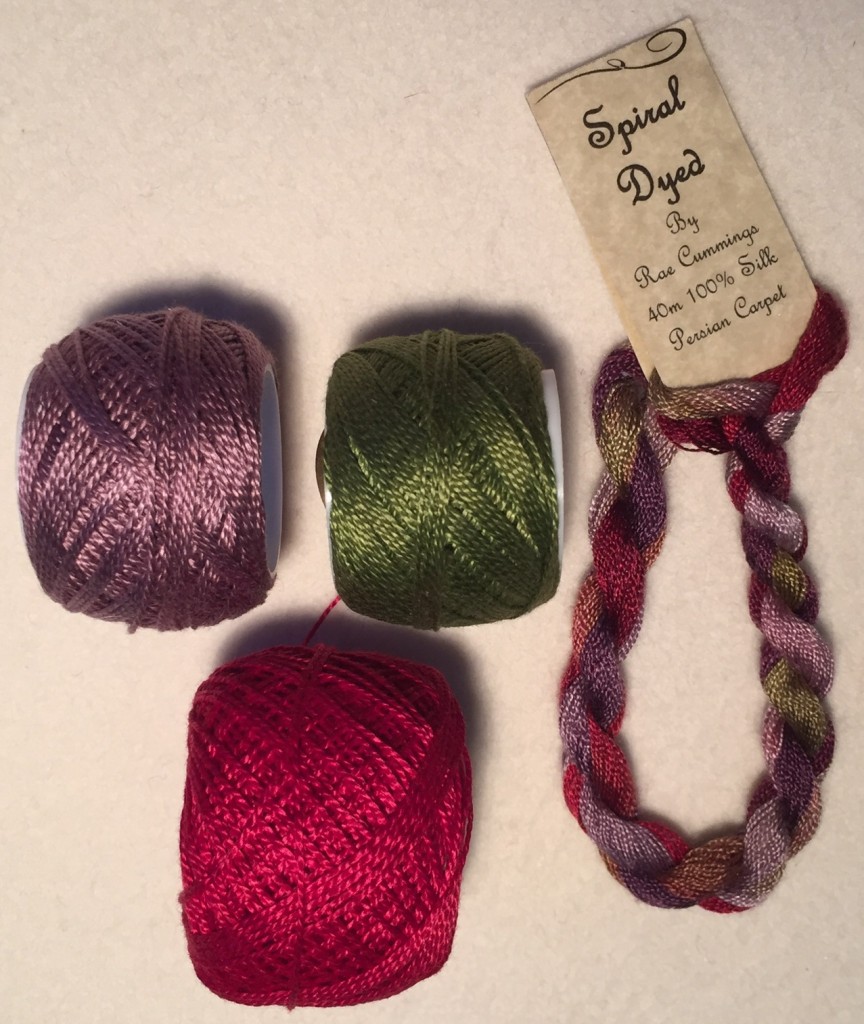
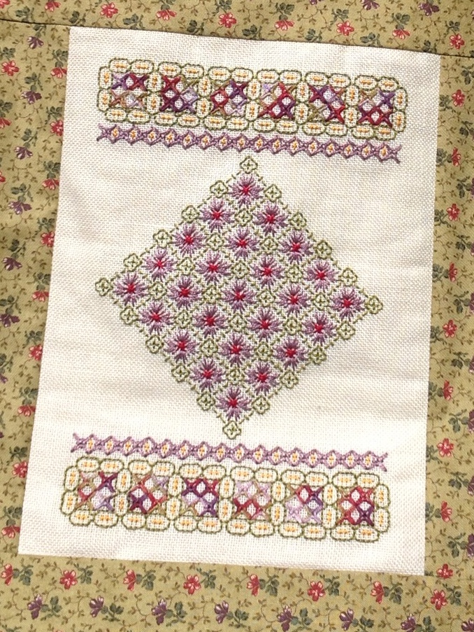
Let’s take a look at another example. One of my favourite colour combinations is purple and green (you can even see that in my logo :)). This variegated silk thread, Spiral Dyed by Rae Cummings – Persian Carpet, is the most beautiful combination of rich purples, reds, and greens. I LOVE it and have used it in countless projects. One of these was a pretty Wessex Work bag with matching A4 journal cover and pencil case. I decided to use the variegated silk for just one element in the design and then selected coordinating cotton Perlé threads for the rest. If you select one shade of each of the red, purple and green you get a beautifully coordinated colour palette, and actually the contrast between the pale purple and the richer red is pretty good.

But I like a little bit of sparkle and zing in my designs, so I needed one more colour to add some extra contrast. I chose yellow and whilst it looks a little garish when you line up the spools next to each other, just a small amount of yellow in the final design is enough to give it a beautiful lift.

“OK”, I can hear you saying. “But you didn’t have a variegated thread or anything to guide you this time. How did you know to choose yellow?”. Well the answer is that I didn’t. I just knew I wanted to add an extra colour to my chosen palette. I stood in the embroidery shop trying a whole range of colours until I decided that the yellow would be just right. This is the point where you have to just start trying things for yourself. LISTEN to your heart and let that five year old colouring-in voice shine through. Choose the contrast colour that you like and try it. And if it doesn’t quite work, don’t get down on yourself – instead learn from your mistake and try something different next time. The more you choose your own colours, the better you will become and the more colour confidence you will feel.
I ABSOLUTELY GUARANTEE IT!
Next time we will look at using something other than variegated threads as your starting point. And really the sky is the limit at that point. Choosing colours becomes so much fun! Remember I told you last time, if I can do it then I just KNOW that you can too. And let me know how you are going in the comments below. I would love to hear from you 🙂


