Hello Beautiful Stitchers! Where are the weeks disappearing this year? I can hardly believe it is the beginning of March already. There are lots of exciting things happening here at the moment. I am so busy that the weeks just feel like they are flying by. I’ll be able to reveal all soon, but in the meantime I want to finish off this series on choosing colours with confidence. I really hope you have found that inner child and started embracing your colour style with energy and enthusiasm!
In Part 1 and Part 2 we looked at some examples of how I use variegated threads to help me choose colours. In this post I wanted to collect together some resources and examples of other avenues you can try when you need colour inspiration.
The most obvious of course is to use a piece of fabric as your starting point. If you are anything like me you have a wonderful stash of fabric, and each and every one is another colour palette just waiting to be tried. (Of course, if you can’t find just the right colour in your stash, then you are just going to have to go shopping – sounds like the perfect excuse to me!). Take the time to stop and look at your fabrics in a slightly different way. Look at the colours the designer has used and how are they balanced. Will that help you with the embroidery project you have in mind?
Here is a random example from my stash.
This bright, bold, floral print has as its lead character [typography font=”Josefin Sans” size=”16″ size_format=”px” color=”#e62c5e”]PINK[/typography]. But there are a number of shades of pink here, so perhaps a variegated thread would be a good choice. Supporting roles are played by [typography font=”Josefin Sans” size=”16″ size_format=”px” color=”#ff7e46″]ORANGE[/typography] and [typography font=”Josefin Sans” size=”16″ size_format=”px” color=”#0bf3e1″]TEAL[/typography], and importantly there are bit parts for two shades of [typography font=”Josefin Sans” size=”16″ size_format=”px” color=”#38a503″]GREEN[/typography]. To select my threads, I would simply take this piece of fabric to my local needlework shop and use it to help me choose the right shades of pink, teal, orange and green. Using the piece of fabric as a starting point makes the colour choice much easier.
Ok – let’s look at another example. I worked this set of embroidered braids a number of years ago and I still have the piece of fabric that I used to help me choose my colours.
This fabric design is a lot busier than the bold floral above but it turned out to be a superb colour resource. First, you can tell overall that the colours of my piece are similar to the colours of the fabric. Just as I suggested above, I took this fabric to my local needlework shop and selected a range of DMC cottons, some beautiful silk threads, and a handful of mohair threads for my colour palette.
But then I went one step further. I used individual elements within the design to help me choose colours for each braid. In this example the leaf element is predominantly the lighter shade of green with supporting roles played by the darker shade of green and gold. And there is just a hint of russet red right at the outer edge. I chose the colours for the braid to reflect that mix.
What about another example? This leaf has a deep russet red alongside a very light cream. The highlights come from yellow, black and blue. The braid I created left out the black because I just felt like it made my design too heavy, but otherwise the colour palette is drawn directly from that little leaf.
Can you see how easy it is? And what great resources you almost certainly have in your stash already? Did I hear you say that you don’t really buy fabric because you are an embroiderer through and through? No problem. What about magazines, or books, or artwork, or photographs? I am sure you have some of those. And they are all WONDERFUL resources for colour.
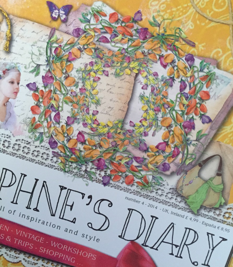
For example, here is a beautiful magazine cover (I confess to having a weakness for good quality craft magazines).
I am drawn to “Daphne’s Diary” purely because she uses colour so well. The wreath here would make a superb colour palette – purple, red, orange, yellow and green – utterly gorgeous (in fact I may have to try it soon!). And all you have to do is take it along with you when you next go shopping for threads. It really is that easy 🙂
So, there you have it. My take on all things related to choosing colour in three parts. And if you want to know more, there are a myriad of other fantastic resources available to you. A few of my favourites are:
[typography font=”Cinzel” size=”18″ size_format=”px” color=”#670898″]Off my bookshelf[/typography]
- Colour and Design for Embroidery by Richard Box – an excellent technical resource with excellent information on each of the main colour hues.
- A Passion for Colour by Ruth Issett – a feast for the eyes. Ruth’s enthusiasm for colour is contagious!
- 2000 Colour Combinations by Garth Lewis – a fantastic library of colour palettes.
- Colour Confidence in Embroidery by Trish Burr – a wonderful book that shows you colour palettes in action in embroidered motifs.
[typography font=”Cinzel” size=”18″ size_format=”px” color=”#670898″]On the web[/typography]
- Paletton – The Color Scheme Designer – an online tool for designing colour palettes from any starting point. It is very easy to use for a specific purpose or just to go exploring.
- COLOURlovers – a seriously mind-boggling array of colour palettes, which can almost be a little overwhelming at times. But it is worth a visit to go exploring and find the amazing number of colour palettes that are possible. Also, many of the palettes are laid out with the colour balance as well, so this is a really helpful feature.
- TinEye Labs MulticolorEngine – a seriously fun tool to choose a range of colours and then see a whole suite of images using those colours. It is kind of colour palettes in revers, but it gives you a really good feel for what your embroidery might look like if you choose a given set of colours.
Please use the comments below to let me know what you think. Do you know of other great colour resources that I could add to the list here? It is always brilliant to hear from you!


Wonderful series!
Thankyou so much Linda! I am glad you enjoyed it. My blog is somewhat neglected at the moment as I am busily getting my Etsy shop ready to open later this month. But I will definitely get back to some more writing once that is done 🙂